Make a Scatter Plot Online
Paste x,y data and get an instant scatter plot you can download.
Make a Scatter Plot Online
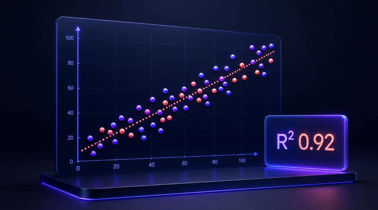
Use this free scatter plot maker to create a clear XY graph from paired numerical data. Paste values from Excel or Google Sheets, import a CSV file, customize the chart, add a line of best fit, and download your finished scatter plot.
It is useful for students, teachers, researchers, marketers, and beginner data analysts who need to visualize the relationship between two numerical variables without using code or complicated spreadsheet chart menus.
How to Create a Scatter Plot
- Paste your X and Y values into the data box.
- Use two columns: the first column is the X-axis and the second is the Y-axis.
- Add a chart title and axis labels.
- Choose point color, shape, size, and transparency.
- Enable the linear trendline if you want to view the overall direction.
- Download the chart as a PNG or SVG file.
The first row can contain column headers, such as Study Time (Hours) and Test Score (%). Invalid or incomplete rows are skipped and reported before the chart is created.
What Is a Scatter Plot?
A scatter plot, also called a scatter chart or XY graph, displays the relationship between two numerical variables. Each point represents one paired observation:
- The first value determines the point’s horizontal position on the X-axis.
- The second value determines the point’s vertical position on the Y-axis.
For example, a student can plot study time against test scores:
| Study Time (Hours) | Test Score (%) |
|---|---|
| 1 | 55 |
| 2 | 61 |
| 3 | 68 |
| 4 | 76 |
| 5 | 84 |
The chart helps show whether higher study time is generally associated with higher test scores.
When to Use a Scatter Plot
Use a scatter plot when you want to compare two numerical measurements and look for patterns.
Common examples include:
- Study time versus exam scores
- Height versus weight
- Advertising spend versus sales
- Temperature versus energy usage
- Exercise time versus heart rate
- Product price versus customer ratings
- Rainfall versus crop yield
- Website traffic versus leads
A scatter plot is different from a line graph. Scatter plots show individual paired values and do not automatically connect them. Line graphs are generally better for showing change over time in a sequence.
How to Read Scatter Plot Results
Positive association
A positive association means Y generally increases as X increases. Points tend to move upward from left to right.
Example: More study time may be associated with higher test scores.
Negative association
A negative association means Y generally decreases as X increases. Points tend to move downward from left to right.
Example: As product price increases, demand may decrease.
Little or no association
When the points do not follow a clear upward or downward pattern, there may be little or no linear association between the two variables.
Clusters and outliers
A cluster is a group of points concentrated in one area of the chart. An outlier is a point far from the main pattern. Outliers can be meaningful and should be checked rather than removed automatically.
Line of Best Fit and Trendline Equation
The optional line of best fit shows the overall linear direction of the data. The calculator uses linear regression to create a trendline equation in this format:
y = mx + b
- m is the slope, showing how much Y tends to change when X increases by one unit.
- b is the intercept, showing where the line crosses the Y-axis.
A positive slope suggests a positive relationship. A negative slope suggests a negative relationship.
The trendline summarizes the pattern, but it does not make every point fit perfectly.
What Does R² Mean?
R², called the coefficient of determination, shows how closely the plotted data fits the linear trendline.
- R² close to 1: The points fit the linear model closely.
- R² close to 0: The linear model explains little of the variation in the data.
For example, an R² of 0.92 means the linear model explains a large portion of the variation in the plotted data. It does not prove that one variable causes the other.
Tips for Better Scatter Plots
- Use clear, specific axis labels with units where possible.
- Keep X and Y values in matching rows.
- Check unusually high or low values for data-entry mistakes.
- Use a descriptive chart title for reports and assignments.
- Avoid treating correlation as proof of causation.
- Set manual axis ranges only when they help make the data easier to interpret.
- Use the trendline as a summary of the overall pattern, not a guarantee of future results.
Scatter Plot Maker FAQ
Can I paste data from Excel or Google Sheets?
Yes. Copy two columns from your spreadsheet and paste them directly into the data area. Tab-separated values are detected automatically.
Can I import a CSV file?
Yes. Use the Import CSV button to load a CSV, TSV, or text data file. Your data is processed in the browser to generate the chart.
Why were some rows skipped?
Rows are skipped when they do not contain two valid numeric values. Check for blank cells, text in numeric columns, or mismatched data.
Can I add a line of best fit?
Yes. Enable the linear trendline option to display a line of best fit, its equation, and the R² value.
Does a trendline prove causation?
No. A trendline can show a relationship or association between variables, but correlation alone does not prove that one variable causes the other.